
Demystifying Vio's new branding
Redesigning our logotype was our most recent project.
What? We redid our logo and its associated branding! Of course, we thought of everything to make it a success. And, now, we felt like presenting you with the result.
Here, therefore, are three points that explain the why and how of our spanking new brand image!
1. Why “Vio”?
Does Vio stand for violin? Or violet? No, not exactly. It refers to the eponymous Latin verb meaning “to proceed.” We like that definition because we consider that our role consists of helping our clients advance both toward and into the digital realm—a complex and sinuous highway that is nevertheless fundamental to the sustainability of any businesses.
At Vio, we believe that Internet immersion is a trip that sometimes requires the assistance of more experienced guides, which is the role we seek to play. We know the rules, the pitfalls, and the winning detours and map out the road ahead to have you experience the most enjoyable of voyages alongside us.
To find your way through the web’s abysmal meanders, isn’t it to your advantage to deal with pros?
2. Why this logo?

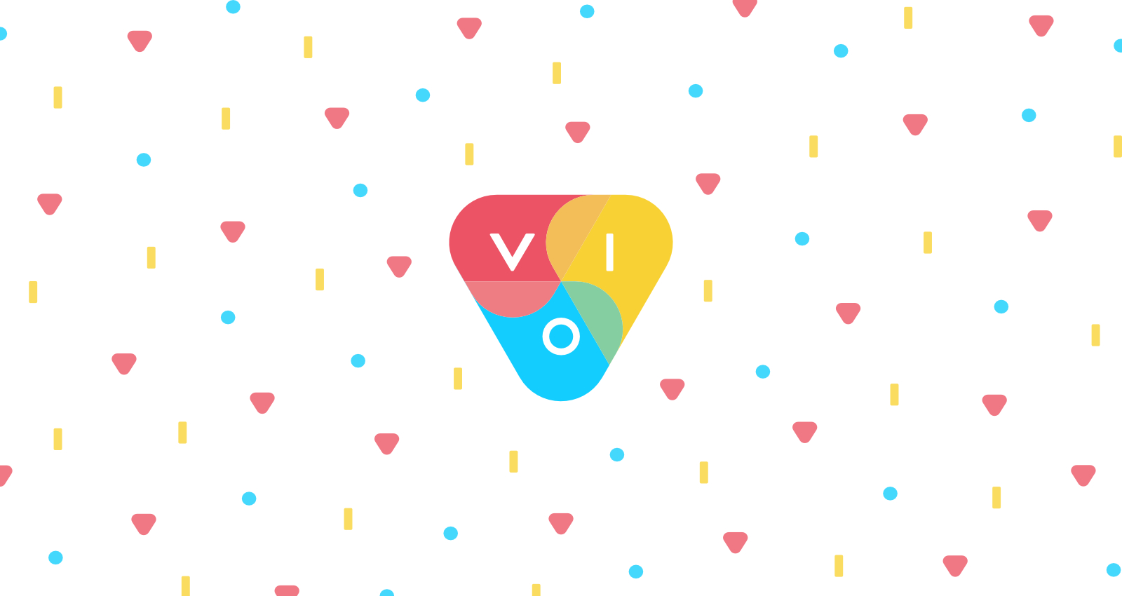
![]()
At first glance, our logo is a colourful triangle, and that’s it. But don’t be fooled, because there’s much more to it than meets the eye. Of that, at least, we are convinced.
In fact, if you look at it more closely, the logo is a small character, more specifically a “winking face emoji”. In our opinion, it conveys our ludic nature as well as our mischievous and friendly character.
Professional, of course, but also warm and entertaining.
Apart from the (obvious) emoji, the logo’s triangular aspect also evokes our ongoing and iterative process. It’s an uninterrupted process that cleverly combines data analysis and strategic ingenuity and that is impeccably executed.
And did you notice that the paler colours depict a propeller, to suggest movement, advancement and progress? We have the wind in our sails…
All in all, our logo embodies our desire to spur growth and create a positive impact through the combination of a plurality of skills.
Isn’t that something wonderful?
3. And what about the colours in all that?
We would be lying if we told you that there was a symbolism in the colours, that we sought to establish mental associations between the colours and our moral values.
Simply said, we find it prettier.
NEVERTHELESS, it perfectly reflects how we are: colourful, vibrant, bubbly, and inviting.
We also wanted to demonstrate that the digital world is not a cold and arid place, but gives room to a healthy dose of singularity.
—-
Successfully combining all of this elements to create such an elegant logo?
That’s Vio’s ingenuity in action.