

Let's Talk Data
I’m what you might call a data geek. One of the reasons I like digital marketing is that we have access to a ton of data that helps us improve our understanding of the world around us and, as a strategist, our decision-making.
Just to put you in context, Excel is my best friend at work. I have a crazy time putting numbers in my files and seeing what happens. I have tremendous respect and admiration for my actuarial and statistical friends. There’s a part of me that’s disappointed to have denied my love for numbers thanks to a bad math teacher in high school who broke my self-esteem (and momentarily my interest in his subject). But that’s not the point of this article. I digress.
The data.
I wondered if we could rely on the data to make business decisions.
There’s a blog article that’s been circulating a lot this week in my Facebook feed about manipulating climate change data that I’d like to summarize for you.
Disclaimer: Although the author of the article, Grant Foster, is quite mysterious and controversial, his point of view is relevant and deserves to be shared. All graphs presented here are taken from his blog.
Here is the average temperature of the 48 continental states of the United States since NOAA (the National Oceanic and Atmospheric Administration) collected data in 1895.
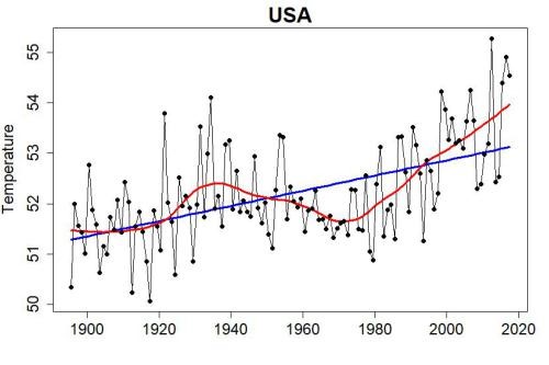
Anyone can see that there is an upward trend. Average temperatures tend to increase with the years. That’s not pretty.
What if this data didn’t suit me?
What if we needed something that would serve our purpose more?
What could we do about it?
We could no longer use average temperatures, but just the coldest temperatures recorded during the year? Maybe we could make the graph say something else that way?
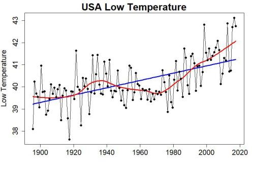
Nope. Same alarming trend.
And the highest?
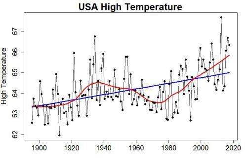
Ishhh. Not much better.
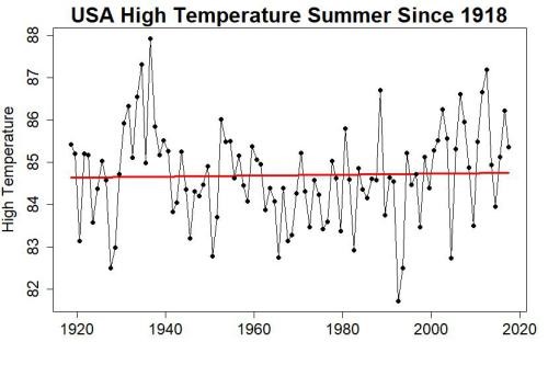
What about seasonal averages?
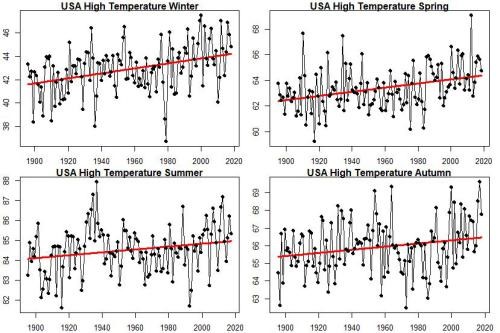
The same upward trend continues.
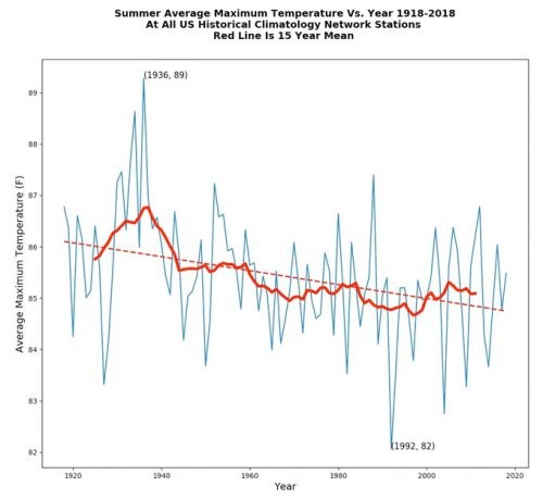
What if we eliminated the data that are the lowest, those between 1895 and 1918?
Ah! Here we have something. It’s less alarming that way. But that’s not exactly what we’d want the numbers to say yet.
The data are from NOAA. They are collected according to a rigorous methodology and processed by their mathematicians for more than a century. Wait, what? Processed? But what does that mean?
That means that between 1985 and 2018, some stations were moved, others appeared and there are more stations further north now than there were 50 years ago. If we want to average the temperatures for a region as vast as the United States, then we must weight the results so that the analysis is not distorted by an overrepresentation of stations in the north, and therefore colder.
I think you know where I’m getting at.
If we explicitly seek to make data say something, we could say to ourselves that the data processed, weighted, does not suit us. One might think that the raw data would be more efficient.
Oh, yeah. It’s working. That way, we seem to be saying that temperatures are dropping. Mission accomplished!
Cheating on a smaller scale
That example is pretty obvious. It’s about intellectual dishonesty being used for anti climate change propaganda.
I would like to remind you that once we collect and analyze data, whether it comes from Facebook, Google Analytics or NOAA, especially when this data is used to influence decisions, we have a professional responsibility. To put it simply: you don’t bullshit. Even on a small scale.
I recently had a case of a customer who saw in the performance analysis reports of his former supplier, his monthly engagement rates on Facebook ranging between 12% and 18%. The regulars of the platform know that it is practically impossible to maintain such a high average over several months.
It made me wonder.
So I took the initiative to check its ratios by reverse engineering with the source data. And I was getting to averages rather around 6% to 10%, which seemed more likely to me. I finally understood that the supplier was using duplicate data when calculating its ratio, which almost doubled the result.
In short
The next time you are shown beautiful graphs in a PowerPoint presentation to influence one of your decisions, ask questions about how the data was collected and analyzed.
Just to see.

📞 514-844-1050 📧 bianka@vionumerique.com